Mixins in an override CSS
Mixins define a combination of reusable text, border, or background styles, enabling you to create incremental styling changes and provide a natural cascading of styles. Use mixins to ensure consistency across your user interface, maximize reuse, and minimize future maintenance. Mixins are defined on the Mixins tab of the skin and can be used throughout an application. You can reference one or multiple mixins to define the appearance of UI components such as buttons or links.
When you use a custom cascading style sheet (CSS) to override the skin, you can reference a mixin in the override CSS so that you can customize the presentation of specific elements while preserving the mixin styling for text, borders, and backgrounds. The benefit of preserving the mixin style is that you can change mixins in the skin at any time. A change to the mixin cascades throughout all elements in the skin that reference the mixin so that you can use the mixins that are defined in the skin in components that are not specifically supported in the skin.
Custom mixin variables that are defined in one override CSS are visible to all the override CSS files in your skin. To use the variable as reference, you must first define it. For best results, define all your custom variables in the top-level override CSS file.
The override CSS for your skin and all the override CSS files attached to the inherited skin are processed simultaneously and will use the values of the mixin that is currently defined in your skin. For example, a skin inherits from the pyEndUser skin, which includes the General typography mixin. If you have an override CSS file attached to the pyEndUser skin and you override the General mixin to change the color, then the override CSS file that is attached to pyEndUser will now use the new mixin value.
Mixin variable format
When referencing a mixin in custom CSS, the format of the mixin reference must follow a specific format. For example, if the mixin name is Header Background, the name of the mixin variable must start with $mx-header_background-xxxx. The format of the mixin variable is defined as:
$mx-<mixin name>-<attribute>
where
<mixin name>is the name of the mixin in all lowercase with spaces replaced by an underscore ( _ ) character.<attribute>is a CSS attribute such as color, font-family, or background. The list of supported attributes is below.
If you want to override the standard button in the override CSS to use the mixin called "Test Border" for the border and the mixin "Error Text" for the color, you can use the following CSS override:
/* override the standard button */

.pzhc.pzbutton {

border: $mx-test_border-border;

color: $mx-input_error_text-color; /* this mixin is coming from pyEndUser */

min-width: 140px;

}
If the mixin variable does not exist, for example if it contains a typo, then it will be replaced by an empty value. To debug this kind of issue, enable the debug log on the CSSCustomParser class and look for an invalid variable definition in the log.
You can use a calculation inside of a variable, for example:
$myheight:200px;

.mycontrol {

height: calc(300px - $myheight );

}
You cannot use mixin variables or refer to mixin settings inside CSS files that are attached to the harness. CSS files attached to the harness are not preprocessed and cannot use custom variables.
It is not possible to override the value of a mixin value such as $mx-general-color in your override CSS files. Because the value is already defined before processing the CSS, it will be replaced with the existing value.
Mixin attributes exposed
The following lists the attributes exposed for each mixin type.
Typography mixins
Typography mixins expose the following attributes:
- font-family
- color
- font-weight
- font-size
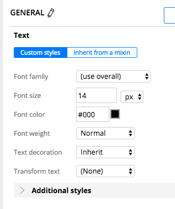
For example, using the "General" mixin, the following variables can be set before parsing any override CSS:
$mx-general-font-size=14px;

$mx-general-color=#000;

$mx-general-font-family=OpenSans,sans-serif;

$mx-general-font-weight=normal;
Border mixins
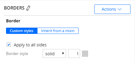
Border mixins expose the three border attributes (style, color, and width) and the shorthand version for all four border positions (left, right, top, bottom) as well as the global border. For example, the border mixin "Test border" exposes the following variables:
$mx-test_border-border-bottom-style=solid;

$mx-test_border-border-bottom=solid #86C543 4px;

$mx-test_border-border-bottom-width=4px;

$mx-test_border-border-bottom-color=#86C543;
The shorthand version is more likely to be used if all the borders have the same settings:
$mx-test_border-border=solid #86C543 4px;
Background mixins
The background mixin exposes the background and background-color attributes. In most cases, the background attribute is recommended.
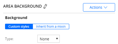
With the background set to none, a "none" background mixin called "Area Background" configured in this way generates the following variables:
$mx-area_background-background=transparent;

$mx-area_background-background-color=transparent;
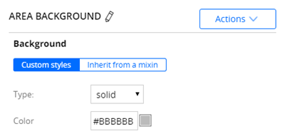
With a solid background, a mixin called "Area Background", configured as shown in the following figure, generates the following variables:
$mx-area_background-background=#BBBBBB;

$mx-area_background-background-color=#BBBBBB;
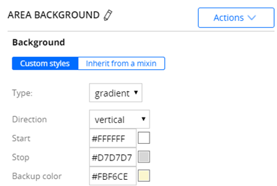
A gradient background mixin called "Area Background" configured like this generates the following variables:
$mx-area_background-background=linear-gradient(to bottom, #FFFFFF, #D7D7D7);

$mx-area_background-background-color=#FBF6CE;
Combination mixins
Combination mixins have all three types listed above: typography, border, and background. Each of these attributes can be turned on or off.
The same type of variables will be generated for a combination mixin depending on which type is enabled.
Support for additional styles in mixins
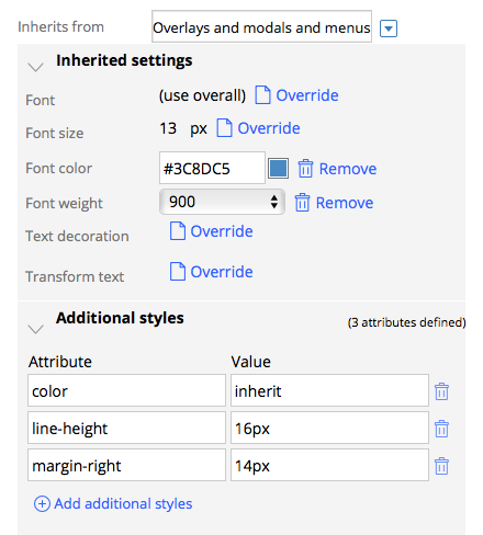
Additional styles are supported for typography and background mixins. These styles are also exposed as custom variables. For example, you can create a general margin mixin and use the exposed variables through override CSS. If the mixin has the following additional styles, the color mixin inherits from the additional style.
$mx-general-font-family=OpenSans,sans-serif;

$mx-general-color=inherit;

$mx-general-font-weight=900;

$mx-general-font-size=13px;

$mx-general-margin-right=14px;

$mx-general-line-height=16px;
Using custom variables
You can use custom variables directly in the override CSS. A variable must start with the dollar sign ($) character and must be defined before being referenced. For example, if your override CSS file contains the following lines:
/* This is my overall margin settings */

$myapplication-margin-right:14px;

$myapplication-margin-left:14px;


/* Change the margin for buttons */

.pzhc.pzbutton {

margin-right:$myapplication-margin-right;

}
When this code is parsed through the CSS pre-processor, the output CSS will be:
/* This is my overall margin settings */


/* Change the margin for buttons */

.pzhc.pzbutton {

margin-right:14px;

}
In this scenario, the value that is assigned to a variable must be static and cannot contain a reference to another variable. For example, the following code indicates that the variable myvar is initialized with the string $mx-general-font-size. There is no evaluation of the value of the variable:
$myvar:$mx-general-font-size;
Viewing the content of the preprocessed CSS file
Use the skin preview to view the content after preprocessing. On the skin rule, click .
CSS override files are encapsulated in a comment with the name of the CSS file. You can download the file and open it with a text editor. The skin preview only shows the override CSS content that is included in your skin and does not contain the override CSS from inherited skins.
/*************************************************************/

/* Additional Style sheet: XXXX.css */

/*************************************************************/