|
 The Dynamic Select control is an HTML <SELECT > element with additional attributes and capabilities.
The standard HTML <SELECT> element presents a fixed list of choices to a user who is completing a form, for example sizes S, M, L, XL, and XXL. In contrast, a Dynamic Select control can present a list that depends on the user's role, the date, the filtered results of a database query, and other factors.
You can specify the following sources for the values appearing in the list:
 You can configure most Dynamic Select controls in a harness, section, or flow action directly, while completing the Harness, Section, or Flow rule form. That approach is simpler and easier to build and test than the older approach described here. See Harness and Section forms — Defining a Dynamic Select control for a field.
Don't use the Dynamic Select control to present a static list. Instead, on the General tab of the Property form, select Local List as the Table Type and provide the values on that tab. Alternatively, select Field Value as the Table Type, and include the values as a set of field value rules.
At runtime, a use of a Dynamic Select control has seven steps:
Complete three steps to configure a Dynamic Select control. Although you can complete the steps in any order, this order is recommended:
If your application can obtain the needed data using a clipboard page, report definition, or list view rule, it is easier to configure the Dynamic Select controls directly in the harness, section, or flow action form, rather than using an activity. See Harness and Section forms — Defining a Dynamic Select control for a field.
The activity may perform any processing required to assemble values into a clipboard page that meets criteria described in this help topic.
As the final step, the Show-Page method formats information on that page into an XML document sent to the user. When received, Internet Explorer displays the choices identified in the document as part of the PRPC form.
The structure of the clipboard page must be similar to that produced by the Obj-Browse method, though it can be produced by any means:
Page List.The sample XML document below contains three pxResults pages. The second and third pages contain values for two properties used in the Dynamic Select control — Company and Account. (The XML document may contain additional elements; they do not affect the processing.)
<?xml version="1.0" ?>
<pagedata>
<pzStatus>valid</pzStatus>
<pxObjClass>Code-Pega-List</pxObjClass>
<pyObjClass>Data-Customer</pyObjClass>
<pxResultCount>3</pxResultCount>
<pxResults REPEATINGTYPE="PageList">
<rowdata REPEATINGINDEX="1">
<pxObjClass>Data-Customer</pxObjClass>
</rowdata>
<rowdata REPEATINGINDEX="2">
<Company>MyCo Incorporated</Company>
<Account>004325</Account>
</rowdata>
<rowdata REPEATINGINDEX="3">
<Company>Micro Small Co.</Company>
<Account>009142</Account>
</rowdata>
</pxResults>
</pagedata>
For example, if your application includes a Data Table class containing a set of product codes, a three-step activity can support the display of these codes in a Dynamic Select drop-down box:
 In many cases, the activity queries the PegaRULES database or another database. Use care to limit the number of rows returned and the impact of this query on overall system performance. Users make fast and accurate choices when presented with seven or fewer alternatives. A Dynamic Select control that displays more than a few dozen choices may cause user confusion or errors, and so may benefit from redesign. When appropriate, enable caching (with the optional
 DSEnableCache attribute) to reduce database traffic.
Complete these steps to construct the control.
You can include the JavaScript functions and calls that support the Dynamic Select control in the HTML code of any type of stream rule. However, when the control is needed only on one or a few user forms, use the standard control rule named DynamicSelect and the Formats panel rather than creating new control rules. See Harness and Section forms — Defining a Dynamic Select control for a field.
1. Create a new control rule in your application RuleSet. By convention, the names of such rules start with DS_.
2. In the HTML code of the rule, incorporate the standard Rule-HTML-Fragment rule named DynamicSelect_Script by using a JavaServer Page tag:
If using JSP tags, enter this text:
<pega:include name="DynamicSelect_Script" type="Rule-HTML-Fragment" />
If using directives, enter this text:
{INCLUDE Rule-HTML-Fragment=DynamicSelect_Script}
3. Code the Dynamic Select control using the following syntax:
<SELECT
DSSource= "value1"
DSCaption= "value2"
DSValue= "value3"
DSLoadMode="mode"
DSDefault= "value4"
id= "identifier"
... >
</SELECT>
where the five listed DSZzzz attributes are required, and additional optional attributes may appear. The ID attribute is optional. (HTML attributes can appear in any order.)
4. Save the control rule form.
Include values for these five required attributes within the <SELECT> element:
Attribute |
Value |
DSSource
|
Identify the activity and its parameters, in the format: pyActivity=ActivityClass.ActivityName&ActivityParamter1= value1&ActivityParameter2=value2 For example, use the following pyActivity=Rule-Obj-.LookupList
pyActivity=ActivityClass.ActivityName |
DSCaption
|
Enter a semicolon-delimited string of property names that form the visible text of Option elements in the Dynamic Select in the format: propertyName1;propertyName2;... For example. to display the name and the label of a class as the text of the Dynamic Select options elements, use the following: DSCaption="pyClassName;pyLabel" |
DSValue
|
Enter a semicolon-delimited string of property names that form the values of the Option elements in the Dynamic Select, in the format: propertyName1;propertyName2;... For example, to set the values of a Dynamic Select to the class names in a list use the following: DSValue = "pyClassName" |
DSLoadMode
|
Enter one of three keywords:
|
Initially, the default value appears as selected.
If no DSOnDemandCaption attribute is set, it's also the caption.
Step 3: Complete optional attributes
These attributes may also appear in the <SELECT > element to refine the appearance and behavior of the control.
Attribute |
Value |
DSDefault
|
Optional. Enter a text value that becomes the default value of the Dynamic Select control. |
DSDefaultCaption
|
Optional. Enter a text value for the caption value in the control. If this attribute is not specified, the control displays "Select...". |
DSTargetID
|
Optional. Include this attribute when the results of another Dynamic Select control on the same harness, section, or HTML form depends on the results selected by the user for this Dynamic Select control. This technique is known as cascading. Enter a semicolon-delimited text value that sets the ID(s) of the other Dynamic Select controls that are to have values that depend on the value selected in this Dynamic Select control. When a selection is made in this Dynamic Select, its value is appended to the parameterName=. The value of the selected option in the first Dynamic Select then becomes the value of the parameter in the activity of the target Dynamic Select.
Cascading exampleFor example, to list properties in a single class in a Dynamic Select, you can define two Dynamic Select controls. The first retrieves a list of classes, and the second control retrieves a list of properties based on the class a user selects in the first Dynamic Select: <SELECT id="DSClasses" |
DSNoDataCaption
|
Optional. Enter text to appear at runtime if the activity returns an empty page. If this parameter is not set, the default text is "No results were found." |
DSDelimiter
|
Optional. Enter one or a few characters to override the default delimiter used to concatenate multiple captions or values. If omitted, the default delimiter is a single space. |
DSOnDemandCaption
|
Optional. Enter a string for the caption of the default value when the Dynamic Select control is set to
For the activity call, follow this syntax: pyActivity=myClass.myActivity¶m=value.... |
DSWaitTime
|
Optional. Enter a value between 1 and 60 to set a maximum period after which processing times out (fail) if no results were received from the activity. If omitted, the timeout value is 3 seconds. Users are not always notified of this failure, though sometimes they may receive the message: Error Connection Timed out error |
DSEnableCache
|
Optional. Set the value to "true" or "false." When set to true, at runtime the Dynamic Select control causes the workstation browser to cache the data. The next time the data is needed (for the same URL from this user), the activity is not called and the cached information reappears. This feature is especially useful when a single HTML form includes more than one Dynamic Select controls that have the same value for the |
DSHidePrompt
|
Optional. Set the value to "true" or "false." When set to true, at runtime the Dynamic Select control does not display "Select..." as the initial option, but uses the first value of the source of the Dynamic Select. The default setting is "false". This is available in the "advanced" portion of the |
Finally, an HTML form presented to the user must include the control.
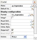 Typically, the control rule is referenced in a flow action or section, to override another control identified in the property itself. For example, in the Field panel of a Flow Action form, the optional Format field defines the control used for the field.
In the unusual case that you compose an entire HTML rule using open authoring, include the usual HTML Name attribute to save the value selected by the user into a clipboard property. For example, if the property is JobSelected:
<Select id="JobDropDown"
Name = "JobSelected"
DSCaption="JobTitle"
DSValue = "pyID"
DSSource="pyActivity=MyCompany-HR-Recruit-JobApp.GetJobList" DSRefreshOnLoad="false">
</Select>
In most situations, this is not necessary, as the system adds the Name attribute and the target property name automatically.
The standard HTML rule Data-Gadget.myGroupDD uses a Dynamic Select control to list operators in the user's work group and to list workbaskets.
Your system includes several control rules named DS_Zzzzz that use a Dynamic Select control. You can use them directly, or copy them using a new name, and modify the copy.
The HTML form listed below includes two cascading Dynamic Select controls. At runtime:
(Both call the standard LookupList activity, which accepts several parameters.)
<HTML>
<HEAD>
<!--set the base of the html to the location
where Dynamic Select scripts exist.-->
<base href="{pxRequestor.pxReqScheme NORMAL}://{pxRequestor.pyHTTPRequestHeaders.pxReqHdrHost NORMAL}{pxRequestor.pxHomeDirectory NORMAL}/">
{INCLUDE Rule-HTML-Fragment=DynamicSelect_Script}
</HEAD>
<BODY>
<TABLE>
<TR>
<TD>Select Workgroup</TD>
<TD>
<Select id="DSWorkGroups"
DSCaption="pyWorkGroupName"
DSValue = "pyWorkGroupName"
DSSource="pyActivity=Data-Admin-Workgroup.LookupList
&pyListName=List
&pyObjClass=Data-Admin-WorkGroup" DSTargetID="DSOperators"
DSRefreshOnLoad="true">
</Select></TD>
</TR>
<TR>
<TD>Select User Name</TD>
<TD>
<Select id="DSOperators"
DSCaption="pyUserName"
DSValue = "pyUserIdentifier"
DSSource="pyActivity=Data-Admin-Operator-ID.LookupList
&pyListName=List
&pyObjClass=Data-Admin-Operator-ID
&p1=pyWorkGroup
&v1="
DSTargetID=""
DSRefreshOnLoad="false">
</Select>
</TD>
</TR>
</TABLE>
</BODY>
</HTML>
If a Dynamic Select control will be used frequently, for best performance make each of the properties that it retrieves exposed columns in the database.
The word ERROR as an element of a drop-down list indicates that the workstation may be disconnected from the server.
The JavaScript DS_loadControl() function loads a Dynamic Select control that it receives as a parameter. This can be useful in dynamic forms. For example, the following call searches the HTML DOM for an element with ID of DSOperators:
DS_loadControl(document.all("DSOperators")); //DSOperators is an ID of a Dynamic Select control.

|
AJAX, Dynamic Select control, exposed property, guardrails, lookup list, open authoring |

|
JavaServer Page tag — Reference
Obj-Browse method Obj-List method |

 Dynamic Select controls — Internal operations and advanced features
 User Interface category