
 Grid layout - Presentation tab

|
|
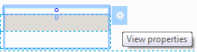
Click the  icon in the Grid Repeat Layout header to display the Properties panel, and then select the Presentation tab.
| Style |
Specify a style for the grid. You can select from:
|
||||||||
| Container format |
Select one of the following container formats:
You can create and modify accordion formats in the skin. See Skin form — Components tab — Layouts — Grids. |
||||||||
| Width of content | Select a grid-width option to determine whether the width of the individual columns within the layout (action and repeating areas) are set as a percentage or in pixel values. Use the options as follows:
|
||||||||
| Fixed (pixel) size grid |
Select this check box if you want to set a fixed pixel size for the grid. Specify the grid width and height in the fields that display. |
||||||||
| Grid size (in pixels) |
Displays when you select Fixed (pixel) size grid. Specify the grid height in the field that displays. |
||||||||
| Display row numbers |
Select if you want to sequentially number the rows in the grid. |
||||||||
| Enable row hovering |
Select if you want an OnHover style for rows, changing the appearance of a row when the cursor hovers over it. You can set the hover text and background color in the Skin rule.
|
||||||||
| Responsiveness |
Select this option to make your grid responsive. Once this property is set, you can specify which columns of the grid should be displayed when the available screen width is reduced, according to the responsive breakpoints you set in the skin. In this section or harness, after closing this panel, you should specify the importance of each column. See the Column Properties Importance settings (below).
|
||||||||
| Display custom message when there are no rows to display |
Check this box to override the default presentation when a grid is empty. You can:
Alternatively, you can save a customized version of the pyGridNoResultsMessage section or GridNoResultsOnLoad field value into one of your application rulesets. |
||||||||
| Do not display grid header when there are no rows to display | Check this box to hide the grid column headings when the grid is empty or has no results after filtering. | ||||||||
| Display custom message when there are no results upon filtering |
Check this box to override the default presentation when your filter criteria yields no matching results. You can:
Alternatively, you can save a customized version of the pyGridNoResultsMessage section or GridNoResultsOnFiltering field value into one of your application rulesets. |
| Column Properties |
These are the properties for your grid columns that you open by selecting the small circle in a column instance.
|
| Header Settings | |
| Title | Optional. Type text to display in the accordion header or subheader. This text may include directives or JSP tags, such as <p:r > or <pega:lookup >.
|
| Include icon with title | Select if you want to include an icon in the title bar. |
| Icon |
Optional. Click |
| Icon title |
If you want to display a tooltip when the user hovers the mouse pointer over the icon, type a text string within quotations, for example, "Select to view list". |
| Body visibility |
As a best practice, use the Condition Builder to edit this field. Click( |
| Run visibility condition on client |
Appears when you select Conditional Visibility and enter a simple expression in the field that displays. Select the Run visibility condition on clientcheckbox to cause dynamic execution of the condition each time the value of a property stated in the condition changes. Conditions are automatically re-evaluated when the user updates a property value. By default, controls that allow typing, such as Text Input, are evaluated when the user leaves the field. To re-evaluate conditions as the user types, use the Apply Conditions action with a Keyboard event. See Control Form — Completing the Control tab. |
| Defer load contents |
Optional. Choose this option to delay loading at runtime of the section content until the user clicks the header. Deferring enables users to start using other parts of the page rather than waiting for this section to load. To enable users to take actions, such as submit, on a work item while other content is still being loaded, configure sections to use defer loaded asynchronous declare pages. See PDN How to configure non-blocking UI using Asynchronous Declare Pages (ADP). |
| Specify a pre-loading activity | Optional. If Defer Load? is selected, you can specify an activity to be run when the container is expanded by a click. This activity can compute property values and other aspects of the expanded container. As a best practice, create a defer loaded wrapper section with the retrieval activity (instead of having multiple defer loaded sections with wrapper activities.) |
 The display may truncate (partially obscure) a data value if the value is wider than width defined by the pixel value. The user can resize the columns to view the truncated content.
 The UI Gallery contains working examples of Row Hover. To view and interact with samples, select
  > User Interface > UI Gallery. In the Tables & Grids area, select Grid. In the See Also column on the right, select Row Actions.
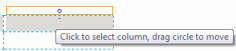
 to open the Image Library landing page and select an image to include on the left side of the header.
 Optional. Leave blank to present the body always. To control visibility of the body, enter or select one of the following:
 )
) ) to open the tool. See