  Skin form —Components tab — Layouts — Tabs Skin form —Components tab — Layouts — Tabs
|
|
- Header
- Body
|
Styles set here apply to tabs. When you create a tab group in a layout, you can select a format in the Style format field in the Tab Group properties panel. Tabs in a harness container always use the Standard format.
You can specify values for text, border, background, height, and indentation of the following tab formats:
- Standard — default format applied to all tab groups (tabs in a harness container, tabs in a section)
- Sub — sub-tab format
- Repeating — tabbed repeat layouts
You can also create custom tab formats and add them to tab groups within sections. Custom formats are not applicable to tabs in a harness container. Tabs in a harness container always use the Standard format.
A preview of the currently selected format displays to the right. You can also preview formats by clicking Run in the toolbar and selecting one of the following preview options: Run Process, Open Portal, Harness Preview, UI Gallery Preview, Skin Preview. In the Skin Preview, click Tabs.
Use the same formatting
| Use the same formatting for Active and Inactive headers
|
Applies the same settings to active and inactive tab headers.
Clear this checkbox to define different styles for active and inactive tabs. Additional fields appear. |
Text
Applies to the text of tab headers. If you cleared the Use the same formatting for Active and Inactive headers checkbox, define styles for Active Text and Inactive Text.
| Use mixin
|
Select to use a mixin to define the appearance of this element. The Mixin field displays the name and a preview of the currently selected mixin. Click  to select a different mixin from the list. to select a different mixin from the list.
- Mixin overrides — Click Add mixin override to override a style set by the mixin:
- Font — Select the font family. The font family defaults to (use overall), which is the font you specified in the Overall Font field at the top of the Mixins tab.
- Font Size — Select the font size in pixels (px), points (pts), em (the current font size), or percentage (%).
- Color — Enter a hexadecimal value (such as #3d3d3d) or click the box next to the field to Choose a Color.
- Font Weight — Select a font weight from the list.
- Text Decoration — Select a text decoration option from the list, if desired. For example, Underline. The blank selection indicates that no additional attributes are applied.
- Transform Text — Select a text transformation option from the list, if desired. For example, Lowercase. The blank selection indicates that no additional attributes are applied.
- Additional styles — Add additional styles, specific to styling the text for this element, by specifying a CSS Attribute and Value. Specify only CSS related to text styles. Click Add additional styles to define another CSS attribute-value pair. Click delete to remove an additional style.
|
| Specify styles
|
Select this checkbox to define a custom text format:
- Font — Select the font family. The font family defaults to (use overall), which is the font you specified in the Overall Font field at the top of the Mixins tab.
- Font Size — Select the font size in pixels (px), points (pts), em (the current font size), or percentage (%).
- Color — Enter a hexadecimal value (such as #3d3d3d) or click the box next to the field to Choose a Color.
- Font Weight — Select a font weight from the list.
- Text Decoration — Select a text decoration option from the list, if desired. For example, Underline. The blank selection is the default, for backward compatibility, and indicates that no additional attributes are applied.
- Transform Text — Select a text transformation option from the list, if desired. For example, Lowercase. The blank selection is the default, for backward compatibility, and indicates that no additional attributes are applied.
- Additional styles — Add additional styles, specific to styling the text for this element, by specifying a CSS Attribute and Value. Specify only CSS related to text styles. Click Add additional styles to define another CSS attribute-value pair. Click delete to remove an additional style.
|
Border
Applies to the border of tab headers. If you cleared the Use the same formatting for Active and Inactive headers checkbox, define styles for Active Border and Inactive Border.
| Use mixin
|
Select to use a mixin to define the appearance of this element. The Mixin field displays the name and a preview of the currently selected mixin. Click to select a different mixin from the list.
If desired, you can specify the Top, Left, Right, or Bottom border as none, solid, dashed, or dotted , rather than inheriting the style from the selected mixin.
|
| Specify styles
|
Select to define a custom border:
- Apply to all sides — select this checkbox to specify the same border style to the top, left, right, and bottom borders. Choose from none, solid, dashed, or dotted.
- If you clear the Apply to all sides checkbox, select a border style for the Top, Left, Right, and Bottom borders. For each of these borders, you can select none, solid, dashed, or dotted. Specify the pixel width and color of the border, if applicable.
|
Background
Applies to the background of tab headers. If you cleared the Use the same formatting for Active and Inactive headers checkbox, define styles for Active Background and Inactive Background.
| Use mixin
|
Select to use a mixin to define the appearance of this element. The Mixin field displays the name and a preview of the currently selected mixin. Click to select a different mixin from the list.
|
| Specify styles
|
Select this checkbox to define a custom background:
Select the background Type:
- none — Indicates no background color, similar to setting a transparent background.
- solid — Enter a hexadecimal value (such as #3d3d3d) or click the box next to the Color field to Choose a Color.
- gradient — Select the Direction in which you want to blend the background colors, horizontal or vertical. Specify the Start and Stop colors of the gradient. Specify a Backup color, in the event that the browser cannot render the gradient.
- image — Specify the following:
- Background Color — to use the background color specified in a mixin; choose obtained from mixin and then click to select the style mixin. Alternatively, you can select custom color and enter the CSS hexadecimal value or click the box next to the field to Choose a Color.
- Location — Enter the location of the file, including the relative path. For example,
images/AlphaCorpLogo.png.
To search for an image, click () to open the Image Catalog tool. Enter any portion of a file name (relative path, file name, or extension) in the Search box, and click Find. If you can’t find the image, make sure it is in the webwb directory. - Tile — Specify tile settings for the image. Select
None if you want to use a single image; Horizontal if you want a row of images in the background; Vertical, if you want a column of images in the background, or Both, if you want rows and columns containing the image in the background. - Position — Specify the placement of the starting tiled image, for example, top left.
For the Standard format only: tabs in a harness container always use the Standard format For Sub, Repeating, and Custom formats - specify a dual image, identifying the Fixed (Left) and Stretched (Right) images. The two images should be from the same RuleSet and version. See About rendering dual background image tabs.
 As a best practice, select As a best practice, select Auto as the Width for the Stretched (Right) setting. The right image must be as wide as
any text you enter into the tabs; the Auto setting
allows the width to expand with the text entered.
By default, the system uses the images you specify here for all four tab positions, automatically generating rotated images, depending upon the tab's presentation.
If you want to specify a different image for each tab position, clear the Use same image for all positions checkbox and specify images for Top, Left, Right, and Bottom.
Specify the following for images, as applicable:
- Image — Enter the location of the file, including the relative path. For example,
images/AlphaCorpLogo.png.
To search for an image, click () to open the Image Catalog tool. Enter any portion
of a file name (relative path, file name, or
extension) in the Search box, and click Find. If you can’t find the image, make
sure it is in the webwb directory. - Width — Enter the width of the image in pixels.
- Tile — Specify tile settings for the image. Select
None if you want
to use a single image; Horizontal if you want a row of images in the background; Vertical, if you want a
column of images in the background, or Both, if you want rows and columns containing the image in the background. - Position — Specify the placement of the starting tiled image, for example, top left.
- Additional styles — Add additional styles, specific to styling the background for this element, by specifying a CSS Attribute and Value. Specify only CSS related to background styles. Click Add additional styles to define another CSS attribute-value pair. Click delete to remove an additional style.
|
Height
| Height
|
Specify the height of the tab by entering a value
in pixels. This height applies to all tab positions and orientations. |
Indent
| Indent
|
For formats other than Standard, specify the tab indent. |
Each tab that uses a ten-part background image is comprised of a left, middle, and right image. Variations of
these images are used to differentiate a tab that is selected (active) or
not selected (inactive). Expanding the width
beyond the width of the image creates a space between it and the
adjoining image. Reducing the pixel size cuts off the image at runtime.
By default, the middle images (active or
inactive) are tiled across the tabbed header and automatically sized to span the
left and right images to equal a total width of 110 pixels. Use the Auto
setting so that the width expands as text is entered in the tab.
Combinations of the tab images comprise a tab rendering based upon the
position and focus of the tab. The three positions are:
- The left-most tab in the array.
- The middle tab between the left-most and right-most tabs.
- The right-most tab in the array.
The examples below show the settings used for each tab position and
its focus:
Left-most tab active
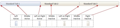
Middle tab active

Right-most tab active

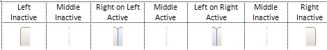
To achieve an overlap effect, use an overlap image in the
Left on Right Collapse and Right on Left. You can use the Image Library to
search for standard overlap images (for instance, search on the word
"overlap". Here is an example of a Left on Right Collapse
overlap:
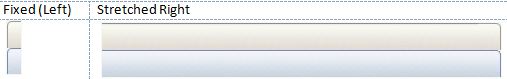
About rendering dual background images
Each tab that uses a dual background image is comprised of a Fixed (Left) and Stretched (Right) image. They display the active and inactive states in the same image and
must be the same height. The Stretched (Right) image must be as wide as
any text you enter into the tabs. Use the Auto setting to
allow the width to expand with the text entered.
The Fixed (Left) and Stretched (Right) images should be from the same RuleSet and version.
The images you specify here apply to both Active and Inactive tabbed headers.
 Creating a new tab format
You can create custom tab formats that you can apply to tab groups within sections.
Creating a custom tab format
To create a new style format:
- Click Add a format.
- In the Create a new format dialog, type the Format name using only alphanumeric characters (a-z and 0-9) and spaces. The name cannot begin with a number. The style name that you enter is converted into the name CSS class/classes.
- Type a Usage annotation, if desired.
- Click OK. The new format is populated with default values.
If you want to create a new format that is a copy of an existing format, right-click the format that you want copy and then click Clone.
Applying a custom tab format
- Add an tab layout. See Section and Flow Action forms —
Adding a Tabbed Repeat layout.
- Click (
 ) to open the Tab Group Properties.
-
In the Tab Group Properties panel, select Other in the Style format drop-down.
- In the field that displays, press the down arrow and select the format that you want to apply to the tab group.
 About Skin rules
 Help Home
