Harnesses form
Completing the Design tab
Use the controls at the top of this tab and drag and drop operations to review or update this harness and associated sections.
Basics
The tab presents a real-time preview of the user form, allowing you to adjust the contents, position, style, and other aspects of the elements in the form quickly. As a best practice, build your application skin, using the Skin rule form, before you develop harnesses.
Areas of the layout that correspond to sections (or other elements) that you cannot update appear with a gray background. This may mean that the rule needs to be checked out by you, or belongs to a locked ruleset version, or belongs to a ruleset version that you are not allowed to update.
Note: When you save this rule form, any other sections you have open that this rule references are also saved and validated as they are saved.
Note: At runtime, the initial state of each collapsible element on a user form — collapsed or expanded — is determined by the state on the Harness form when you save the form.
Caution: Using the Harness form to review or update a harness creates a clipboard page and initializes properties. This may in turn cause declarative processing to execute. Use caution before implementing any OnChange declarative processing that produces database updates.
Controls that alter the preview
The preview area of this tab holds an approximate visual presentation of the runtime appearance of the harness. These buttons do not affect the contents of the rule, only the display on this tab:
-
Click the  button to present the wireframe preview. Blue wireframe rectangles help you understand the structure of the section, names of rules referenced in this rule, and the size and other relationships of elements in the section.
-
Click the button to hide wireframes, providing a less busy and more faithful preview.
Controls that alter a layout
These controls operate on layout structures. Select one or more cells first, then click the control to apply the operation described. When a control is not available (grayed), it cannot be applied to the current selection.
Control
|
Description
|

|
Cut the selection.
|

|
Copy the selection.
|

|
Paste the contents in the selected area.
|

|
Delete the contents of a single cell (not a row or column).
|

|
Insert a new row before (above) the selected row.
|

|
Insert a new row after (below) the selected row.
|

|
Delete the selected row.
|

|
Insert a new column before (to the left of) the selected column.
|

|
Insert a new column after (to the right of) the selected column.
|

|
Delete the selected column.
|

|
Merge right — Combine the selected cell and the cell to the right.
|

|
Merge down — Combine the selected cell and the cell below it.
|

|
Unmerge — Undo the previous merge.
|
You can also use keyboard shortcuts and right-click context menus to cut, copy, paste, and delete.
Select a layout, section include, column, row, or cell and then:
- Cut (
CTRL + X), Copy (CTRL + C), Paste (CTRL + V), or Delete. For the full set of keyboard shortcuts that are supported, refer to the Shortcut definition.
- Right-click and select: Cut, Copy, Paste, Delete, Insert Row, Insert Column, Delete Row, Delete Cell or Delete Column. When copying an entire layout, select Paste Above or Paste Below.
Updating Controls
If the section contains deprecated controls for which there are auto-generated alternatives available, an Update Controls option displays.
Click Update Controls to automatically update the deprecated controls. Buttons with custom settings must be manually converted to use the pxButton control. To add controls to those automatically updated, see Upgrading deprecated and outdated controls on the PDN.
| Deprecated |
Replacement |
TextArea
TextAreaSmall
TextAreaWithExpandSmall
TextAreaExpanded
|
TextAreaWithExpand
TextAreaInTable
TextAreaExpandedOverflow TextAreaWithExpandExpanded
|
pxTextArea |
Date-Calendar
DateTime-Calendar
DateTime-
CalendarHarness
DateCalendarForDataGrid
Export_Date
Export_DateTime
SecondsToHours
SelectDate
SelectDateTime
DateTime
DateTime-Default
DateTime-Full
DateTime-Long
DateTime-Medium
DateTime-Short
DateTime-Full-i18n
DateTime-Long-i18n
DateTime-Medium-i18n
|
DateTime-Short-i18n
Date
Date-Full
Date-Long
Date-Medium
Date-Short
Date-Full-i18n
Date-Medium-i18n
Date-Short-i18n
Time
Time-Default
Time-Medium
Time-Short
TimeElapsed-HMS
TimeZoneList
Time-Full-i18n
Time-Long-i18n
Time-Medium-i18n
Time-Short-i18n
|
pxDateTime |
PromptSelect
DynamicSelect |
pxDropDown |
| RichTextEditor |
pxRichTextEditor |
| AutoComplete |
pxAutoComplete |
| URL |
pxLink |
| Checkbox |
pxCheckbox |
| RadioButtons |
pxRadioButton |
| Button |
pxButton |
Areas of the layout that correspond to sections (or other elements) that you cannot update appear with a gray background. This may mean that the rule needs to be checked out to you, or belongs to a locked ruleset version, or a ruleset version you are not allowed to update.
Tabs and +/- controls
Sections in a harness may be presented as horizontal elements or as clickable tabs. These are "live" in the Design tab; click a tab to bring it to the front, or click a plus sign to expand a section.
When you save a Harness rule form, the state of these controls is saved as well, and determines the initial presentation of the form. To achieve the desired results, before you save the Harness rule form:
- Click one tab to make it front-most when the user form initially appears at runtime, or
- Click the + or - as desired to control the initial presentation of a section or other element.
Structure of a harness-based form
Structurally, every harness consists of one or more containers. (The container structure is not required for those harnesses that are defined through handcrafted HTML code.) A container can provide a visual grouping of multiple sections.
Headers belong to containers. A container may have a horizontal header, a set of tabs identifying the (top-level) sections it contains, or no header.
Each container can contain one or more sections, which in turn can contain layouts, repeating layouts, and other sections. Sections contain layouts.
Prototyping a harness before the work item properties are defined
You can rapidly mock up the layout, labels, and controls on this tab before all properties it ultimately will reference are defined. The development effort you make in designing layout is not wasted, as the resulting harness is a valid starting point for further evolution after the properties are created.
When you first drop a control dragged from the Basic Group, the control initially references a standard placeholder property, for example @baseclass.pyTemplateInputBox. You can save and preview the Harness form (although these properties are not part of your application's work items).
To produce a harness with the appropriate layout, drag and drop the controls, adjust the labels, but do not complete the Cell Properties panel. Reopen the Harness form and update each Cell Properties panel later, when the real properties are defined.
For an example of this approach, see PDN article Use pyTemplate properties and controls to rapidly prototype user forms.
Layout Group:  Adding a container, section, layout, tab, or repeating layout
Click the down arrow ( ) in the Container control group () and select a control:
Control
|
Description
|
|
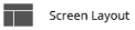
Add a screen layout to this harness. See Adding a screen layout.
|
|
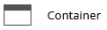
Add a container to the harness form. Every harness must contain at least one container, and every container must contain at least one section. See Adding a container.
|

|
Add a layout to the section included in a harness container — a <TABLE> element containing one or more rows and one or more columns. You can then change the number and size of rows and columns, and set up the contents of each cell (a <TD> HTML element). See:
|

|
Add a section to a harness container. See Adding a section.
|
|
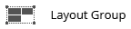
Add a layout group to a harness container. See Adding a layout group.
|

|
Add a tabbed container to a harness. See Adding a tabbed container.
|
|
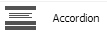
Add an accordion container to a harness. See Adding an accordion container.
|
|
Add a dynamic container to a harness. See Adding a dynamic container.
|
Basic Group:  Placing a property or label in a cell
A cell can hold a label or property value or a form field that accepts a user-entered property value. The property value uses a control to present the value in read-only or read-write mode.
Click the down arrow () in the Basic control group () and select a control:
Control
|
Description
|

|
Add a static read-only text label into a cell. See Adding a label.
|
|
Add formatted text to a cell. See Adding formatted text.
|
|
Add a Text Input, which corresponds to .pxTextInput control. See Adding a Text Input control.
|
|
Add a TextArea, which can contain more than one line of text. Corresponds to the.pxTextArea control. See Adding a Text Area control.
|
 |
Add an icon or image to the form, in a cell or on a header. When clicked at runtime, the icon starts an action. Corresponds to the .pxIcon control. See Adding an icon or image.
|

|
Place a button into a cell or at the bottom of the form. When clicked at runtime, the button starts an action. Corresponds to the .pxButton control. See Adding a button.
|
 |
Add a check box representing a TrueFalse value. Corresponds to a .pxCheckbox control. See Adding a Checkbox.
|
|
Add a radio button group representing a property value. Corresponds to the.pxRadioButtons control. See Adding a radio button control.
|
 |
Place a text link in a cell. When clicked at runtime, the link starts an action. Corresponds to a .pxLink control. See Adding a Link control.
|
 |
Add a text box containing a Date or DateTime value. Corresponds to the .pxDateTime control. See Adding a Calendar control.
|
|
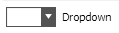
Add a Dropdown control to present a list of values. Corresponds to the .pxDropdown control.
|
Advanced Group 
Click the down arrow () in the Advanced control group () and select a control:
Control
|
Description
|
|
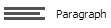
Reference, in a cell, a paragraph rule that presents only read-only text and images using rich text. Optionally, you can link a SmartInfo pop-up section with the paragraph. See Adding a paragraph.
|
|
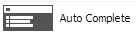
Use an AutoComplete text box to present a drop-down list of dynamic choices computed by an activity. See Adding an AutoComplete field.
|
|
Add a red label that opens a pop-up SmartInfo section when the user hovers the mouse pointer over the label. See Adding a Smart Label.
|
|
Adding a control that allows multiple selections from a possibly long list. See Adding a list-to-list control.
|

|
A cell can contain a chart. See Adding a chart.
|
|
For harnesses that are part of a composite application built with Internet Application Composer only. Add a hidden field to expose a property value, making it available to the external page that displays the composite application. See Adding a Data Field control.
|
|
Add a menu to a composite portal. See Adding a Menu Bar.
|
|
Add a rich text editor control. Corresponds to the .pxRichTextEditor control. See Adding a Rich Text Editor control.
|
|
Used to capture a user signature, either by using a mouse or through touch input on a mobile device. Corresponds to the pxSignatureCapture control. See Adding a Signature Capture control.
|
|
Used to specify an address or location in Google Maps from within an application. Corresponds to the pxAddressMap control. See Adding an Address Map control.
|

|
Used to connect to an external application and delegate access to OAuth 2.0-resources. Corresponds to the pxInformationMashup section. See Adding an Information Mashup section. |
Note: In addition to these Advanced controls, you can add interactive data displays to support quick review or editing for a Page List or Value List. Adding a Tree, Adding a Grid, Adding a Tree Grid.
Dragging a property from the Application Explorer
You can complete two cells of a layout in one step if the left cell is to contain a text label and the right cell is to contain a field corresponding to a property on the Application Explorer.
- Locate and expand the work type that contains the property on the Application Explorer.
- Expand the Data Model category and the Property rule type to list property names.
- Select the blue dot (
 ) for the
 Single Value property to be placed in the field. Drag and drop the dot into the desired cell.
- The system places the Short Description text of the property as a label in the left cell. It places the property as a (read-write) field in the right cell. You can adjust the settings for these cells.
Note: You cannot use this tab to modify sections (referenced in the harness) with the Auto-generated HTML check box cleared (on the Advanced tab). These are marked Manual HTML on this tab. Similarly, you cannot use this tab to modify sections are in the legacy format. These are marked Not Upgraded on this tab.
 Related information
Open topic with navigation