How to add a Tree Grid layout to a section
Summary
Use a Tree Grid layout (introduced in PRPC 6.1) to present or collect data that is in a parent-child relationship, such as a list of objects, each of which may contain sub-objects. While it is hard to display the relationships between such objects in a traditional grid, Tree Grid and Tree layouts both present the relationships clearly and let the user focus on an area of interest by expanding or compressing various "branches" of the "tree" of data.
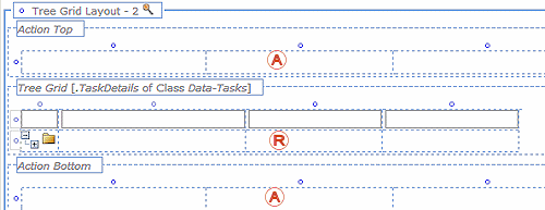
Tree Grids have dynamic repeating sections ( in the image below) that show as many rows as are needed to display the selected data. A row, representing a data object, may have many "children", or sub-rows.
Above and below the repeating section are action sections ( in the image below) which do not repeat. The action sections can hold buttons linked to standard actions, such as "Add child" or "Remove selected", that the user needs to work with the display.
You can also insert buttons, checkboxes, and radio buttons into cells in the repeating section of a tree grid. Buttons in the repeating section connect to express actions ("Add child"; "Open") that generally relate to the currently-selected row.
Suggested Approach
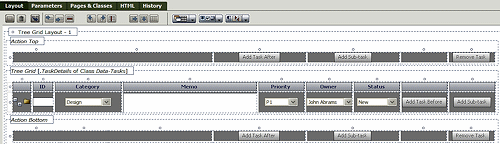
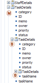 In this example, the team is using a tree grid to display tasks for a project and to capture the sub-tasks related to the main tasks. The property associated with the Tree Grid is a Page List property, TaskDetails. Each page list includes within it a Page List property to support a sub-task, and that property in turn contains a Page List property to support sub-sub tasks.
In the image at right,  indicates the main Page List property, and
  indicates its embedded Page Lists for sub- and sub-sub-tasks (the property for the sub-sub-task is not expanded).
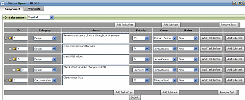
The manager can enter as many tasks and sub-tasks as are needed, adding tasks before, after, or as sub-tasks to existing tasks. The Tree and Tree Grid controls do not have any absolute limit to the number of sub-levels they can display, although in practice the application can slow significantly when the number of "children" gets very large (near 100 levels). This is not likely to inhibit real-world work.
Deploying a Tree Grid layout to enter and display tasks and sub-tasks takes three general steps once the Page List property exists:
- Add the layout and connect the property to it.
- Add controls to the repeating section.
- Add buttons to give access to standard actions.
- Adjust the look and feel of the layout.
1. Add the layout and connect the property to it.
There are two methods for this section:
A. Start with the layout
- Select or create a section.
- Click the down-arrow at the right end of the Layout group (
 ) and select Layout (
 ).
). - Click and drag the layout onto the section. When the pointer changes shape to indicate that you can drop the layout, release the mouse button.
- On the Layout Options form:
- Click the Repeating radio button.
- Select
Tree Gridas the repeat type. - Click OK.
- Open the properties panel for the Repeat Grid section of the layout. In the List/Group field, select the
Page Listyou want to display: - Delete any default layout you do not need and save the section.
B. Start with the data
- Select or create a section to hold the layout.
- In the Application Explorer, select the
Page Listthe layout will display, and drag it to the section. - Drop the Page List onto the section, above or below the default layout. In the pop-up dialog that appears, select
Tree Gridas the layout type.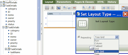
- You do not need to assign the Page List to the grid, as that has happened automatically.
- Delete any default layout you do not need and save the section.
2. Add controls to the repeating section
 After you have identified the Page List as the property the Tree Grid displays, Specify which properties in the Page List populate which columns in the Tree Grid.
All of the Page List items in the tree must be read/write. You cannot directly use DECLARE pages in the tree.
As with any data display, you may need to add a control like a dropdown menu or a checkbox to make a useful representation of the data.
- Click the down-arrow to the right of the Basic group (
 ) to display the available controls.
 - Drag the controls you need to the cells in the repeating row where they are needed, and set each one to display the correct data item.
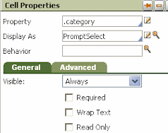
In the example to the right, a PromptSelect control is being used to display a list of task categories.
You can use the additional settings to refine the display: for instance, you can make a control required, or visible only under certain circumstances.
3. Add buttons to give access to standard actions
Tree Grids do not have built-in controls for adding, removing, or manipulating data objects they display. You can add buttons to the top or bottom action areas can initiate a wide range of activities when clicked; a typical example is adding a blank row to the grid so more data can be added.
Buttons you add to the repeating area of the grid control are known as express action buttons. They generally provide a quick way to perform some action on the work object that the row they are in represents: "Quick Approve", "Send for Audit", "Add Note", or some custom activity you create.
Add a button to the top or bottom action area
- Select a button control and drag it to one of the cells in either action area.
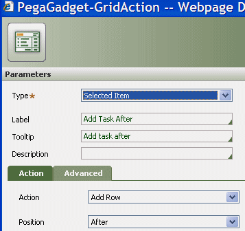
- Open the button's properties panel. Note that the Use Section field is set to pzGridAction. Select the magnifying glass beside the field to open pzGridAction's parameters panel.
- Set the Type to Selected Item, give the button a meaningful label and tooltip, and select the action that takes place when the user clicks the button:
Add an express action button
- Click the down-arrow to the right of the Basic group () to display the available controls.
- Select the button control and drag it to an empty cell in the repeating-row area of the tree grid.
- Open the button's properties panel.
- If you want the button to appear only in the currently-selected row, check the Show when active checkbox in the Generaltab.
- If this option is unchecked, the button will appear in every data row in the grid.
- Note that the Use Section field is set to pzGridAction. Select the magnifying glass beside the field to open pzGridAction's parameters panel.
- Set the Type to Selected Item, give the button a meaningful label and tooltip, and select the action that takes place when the user clicks the button.
4. Adjust the look and feel of the layout
Add an icon to a button
On the Advancedtab of either button type you can specify an icon for the button. If you set this, the button does not need a label; however, make sure it has a meaningful tooltip to help users understand its function.
- Select
 > User Interface > Galleries > Image Gallery and browse the available images. When you find an appropriate image for the button, select the image; then copy its Path from the Selected Image display:
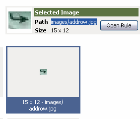
- In the section you are working on, select the button, open its properties panel, and select the magnifying glass to open the properties panel for pxGridAction. In the Advancedtab, paste the image path into the Icon Class field.
- Save the section rule.
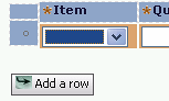
- At runtime, the button appears with its icon:
Styles
You can adjust how the tree good looks to match the expectations of your organization and your user community. You can use existing styles in your style sheet or make use of inline styles:
- Select a row in the layout, either in the action sections or in the repeating section. Click the magnifying glass to display the Row Properties panel.
- Enter the style specifications in the Inline Style field. For ease in specifying the style elements, click the magnifying glass beside the field to display the Style Editor:
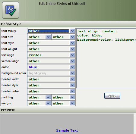
- When you are satisfied with the style, as it displays in the preview panel at the bottom of the Style Editor, click Save.
With buttons and styling in place, the layout looks like this:
At runtime, with a user entering tasks and sub-tasks, the Tree Grid would look like this:
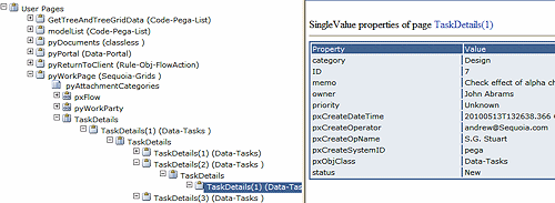
This is the clipboard view of the same data::