Using charts in the user interface
Adding a chart to a section in the user interface can make it easier for users to understand and act on the information that is displayed in the harness. A chart can show the changes of values over time (for example, sales per division per quarter) and the relative significance of different data values on the web page (such as revenue generated by each product in the product line) in a graphical form. Users can make appropriate business decisions based on the information that is displayed on the charts.
The Pega 7 Platform provides the following types of charts for the user interface:
- Pie – The data values are displayed as wedges in a pie.
Column – The data values are displayed as vertical bars.
Bar – The data values are displayed as horizontal bars.
Area – The data values are displayed as lines with the area between them and the X-axis shown as colored regions.
Line – The values of each data column are displayed as points on a line.
Gauge – Gauges are an effective format for displaying burn rate, throughput, and other measurements of the current state. The visual layout options range from tachometers to LED displays to a thermometer.
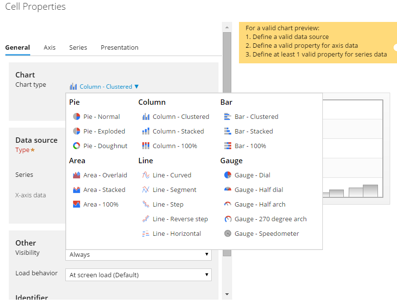
Types of charts in the Pega 7 Platform
Based on the type of chart that you select, you can also see subtypes for each of the chart types in the list.
Before you use a chart control in your user interface section, select a data source for the chart.
- Data page
- Clipboard page
- Report definition
To add a chart to your user interface:
- On the Design tab, click .
- Select Chart from the Advanced menu and drag it to the section.
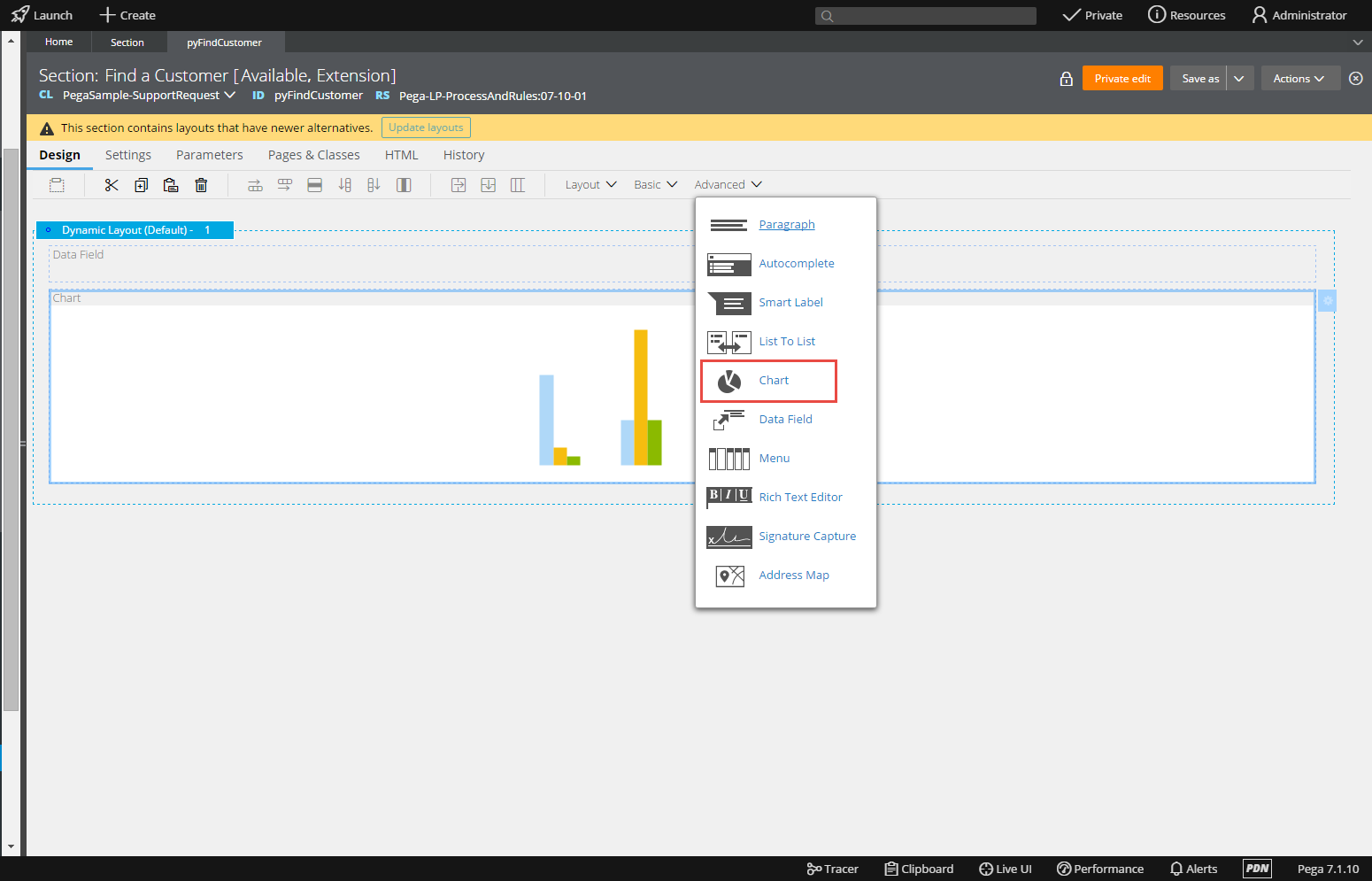
The chart control that is displayed under the Advanced menu in the Design tab
- Click the icon for the chart control.
- Select the type of chart.
- Set the Data source for the chart (usually a data page, clipboard page, or a report definition).
The settings that are available for this section depend on the type of chart selected. For example, you might see Series and X-axis settings for a column chart and a Wedges data setting for a pie chart.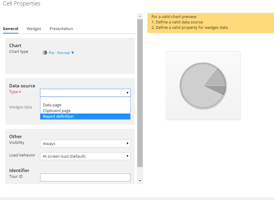
The data source for the chart control
- Click .